


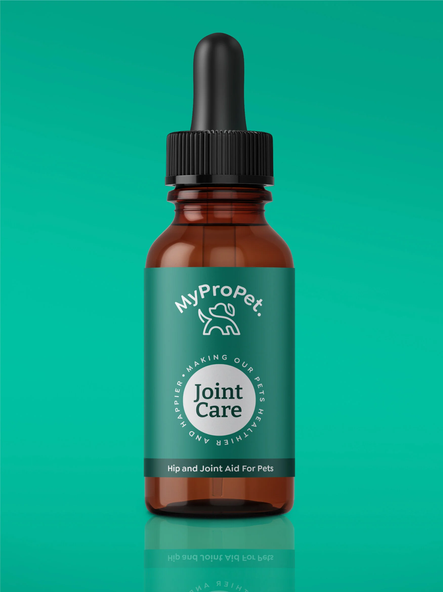


To create branding that is contemporary, premium and personal and to change our audience’s perception of pet nutrition, whilst making it understandable and relatable.
The client wanted an identity that symbolised their brand and connects directly to their audience. More to the point, they wanted an icon that would represent 'organic pet nutrition' in a modern, contemporary manner that would stand out among their competitors on-shelf.
Logo animation, which demonstrates the brand’s sense of character.
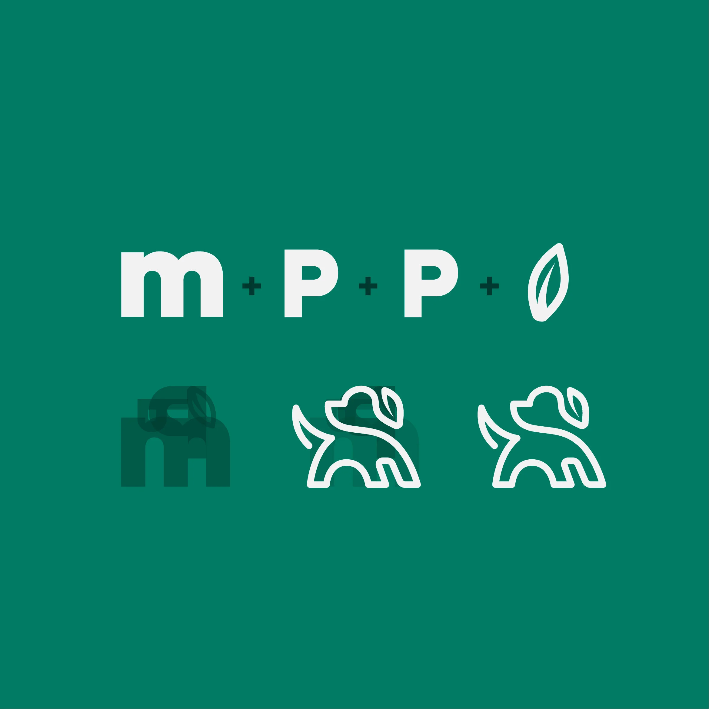
The idea behind the 'Dog mark' was to form a symbol out of the core essence of their brand. For this, I used their initials ‘M P P’ and a leaf which is a symbol of an organic and clean product, making it personal and meaningful for the brand and their customers.
The 'Dog mark' represents their brand in an organic manner, forming the silhouette of a dog out of the brand’s initials while incorporating a leaf icon within the ear that represents their core ingredients all in one elegant stroke.